Did you know us designers differentiate between different types of logos? Yes, they are all made up of images and typography but all the ways they can go together will give the viewer different impressions of your brand. Since your logo is the thing most of your customers will see first, you’ll want to choose the one that’s right for you.
Let’s look at 8 different types of logos:
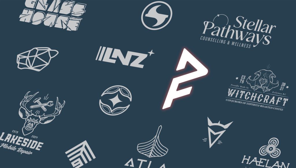
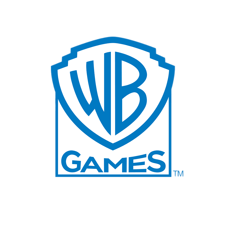
Combination Mark
This type of logo is the most common for new businesses as it displays both the wordmark or lettermark of the company with the pictorial, abstract, or mascot mark. This way your customers can begin to associate the imagery, with the company name. These types of logos are also more easily trademarked as they create a distinct image together unlike say a pictorial of a common object.
Later on, when a company brand has become more popular, they can move to using only imagery to sell their products, such as Apple or Nike for example.
Abstract Mark
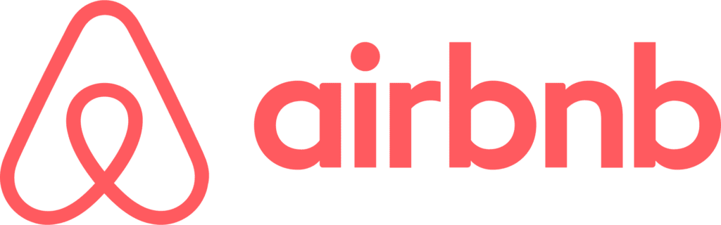
An abstract mark is a symbol, like a geometric form, that is not a recognizable real-world item like a pictorial is. They are popular in today’s tech world and can be a unique way to represent your company. Popular abstract marks include Pepsi’s divided circle, the stylized A of AirBnB, or the new Meta (formerly FaceBook) infinity loop.
Using shapes and colour, abstract marks strive to evoke feelings and emotions in their viewer. Think of the fun, bright colours of Pepsi and the flowing look of the middle white portion over the blue, like liquid in a glass.

Lettermark / Monogram
A lettermark or monogram logo displays a company’s initials or a condensed version of their full name. If your company has a long name, that may not be very versatile when put in full into a logo. It may also be used when a business has a corporate-sounding name and wants to elicit other types of emotions not typically associated with big business.
Some famous examples include IBM for International Business Machines Corporation, BBC for the British Broadcasting Corporation, or think how much more memorable NASA is as opposed to the National Aeronautics and Space Administration.


Wordmark
Like a lettermark, this type of logo relies on a stylized font to state the company’s name. It is important that the font here is unique and designed in a way to showcase the messages your company wants to send its customers.
These logos work best when a company has a distinct name and one that isn’t too long. Remember that your company name in a trendy font alone is often not distinguishable enough to build a recognizable brand around.
Pictorial Mark
Sometimes referred to as a symbol or brand mark, this is an image-based logo. It can be an icon or a graphic, but it is most likely the first thing you think of when you hear the word “logo”. The Nike swoosh, Twitter’s bird, or McDonald’s golden arches, are all examples of a pictorial mark. It is important to choose an appropriate picture to associate with your company as this will stay with the brand for some time if done correctly.
The brands mentioned above are so well known that you can easily identify the company through their symbols (or pictorials) all by themselves. This type of logo is not recommended for new businesses but can be abstracted from a combination mark or created later when a company’s customer base has reached a certain point.
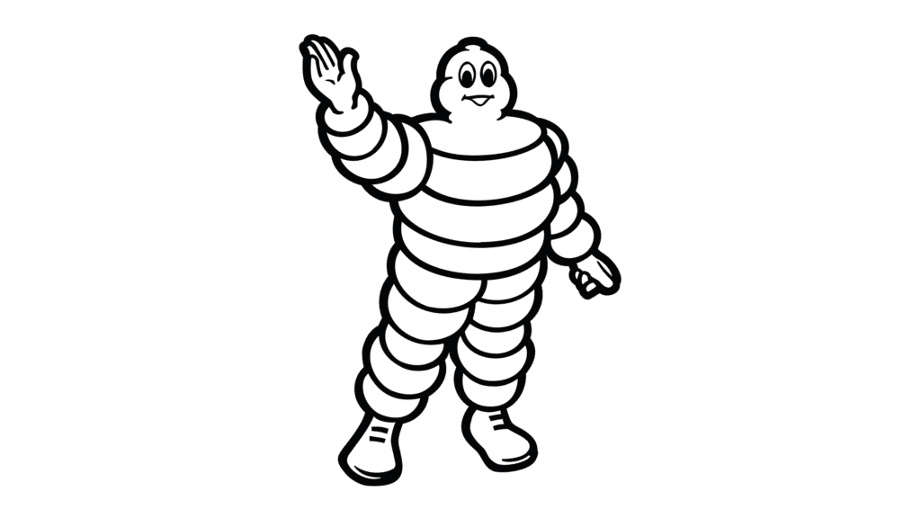
Mascot Logo
If you want to choose a character to represent your brand, then a mascot logo is the way to go. It incorporates an illustrated persona that acts as a spokesperson for the company. It can be colourful, cartoonish, a caricature, or even a mythical creature. These are most often associated with food and beverage companies or sports teams but appear in many other industries as well.
Some mascots most of us are familiar with in logos would be the Mr. Clean man, Wendy’s red-headed girl, or Babybel’s laughing red cow. They are most often used to give a wholesome, inclusive, community type of feeling to customers, hence their usage in sports.
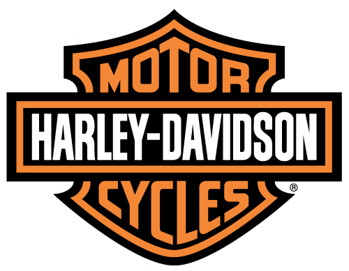
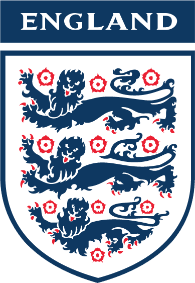
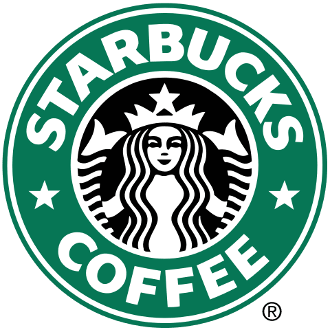
Emblem Logo
An emblem logo can be differentiated from a combination mark because the company’s wordmark is placed inside of a badge, crest, shield, or seal of some kind. They are one of the oldest forms of “branding” and so they can have a traditional type feel to them. Modernized versions have come into style as well for custom, boutique types of shops – think craft beer or local cafes.
To make these types of logos more versatile, it is best to make them simple or create a standalone wordmark that can be used in situations where a more elaborate logo will not do.
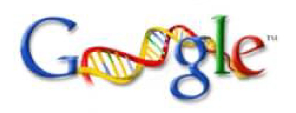
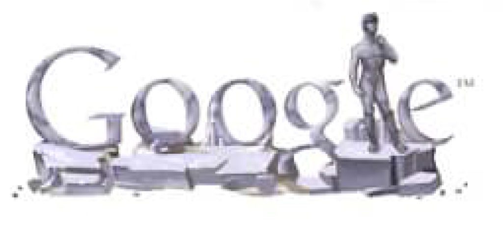
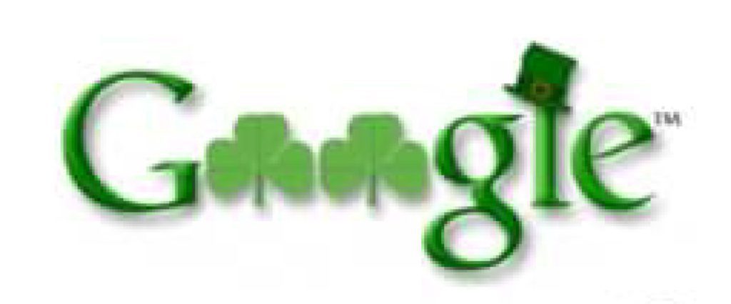
Dynamic Logos
One of the newest types of logos, a dynamic logo is one that can change over time but retains characteristics so that you still know what company it is for. It almost always includes the company name or initials as part of the design to ensure this recognizability. One of the most famous examples of this is Google’s front-page logo and the many different shapes it can take for various occasions.
Reasons for having a dynamic logo can be to keep a company fresh and engaging, it can be to distinguish multiple branches or divisions of a larger company, to keep in the spirit of a holiday season, or even represent the changing of the seasons. Whatever the reason, they are gaining popularity and allow a company more creative freedom in how their brand portrays itself.
Need any help deciding what kind of logo might work best? Contact me and let’s create something right for you.