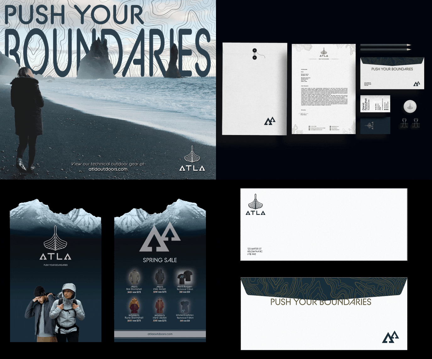
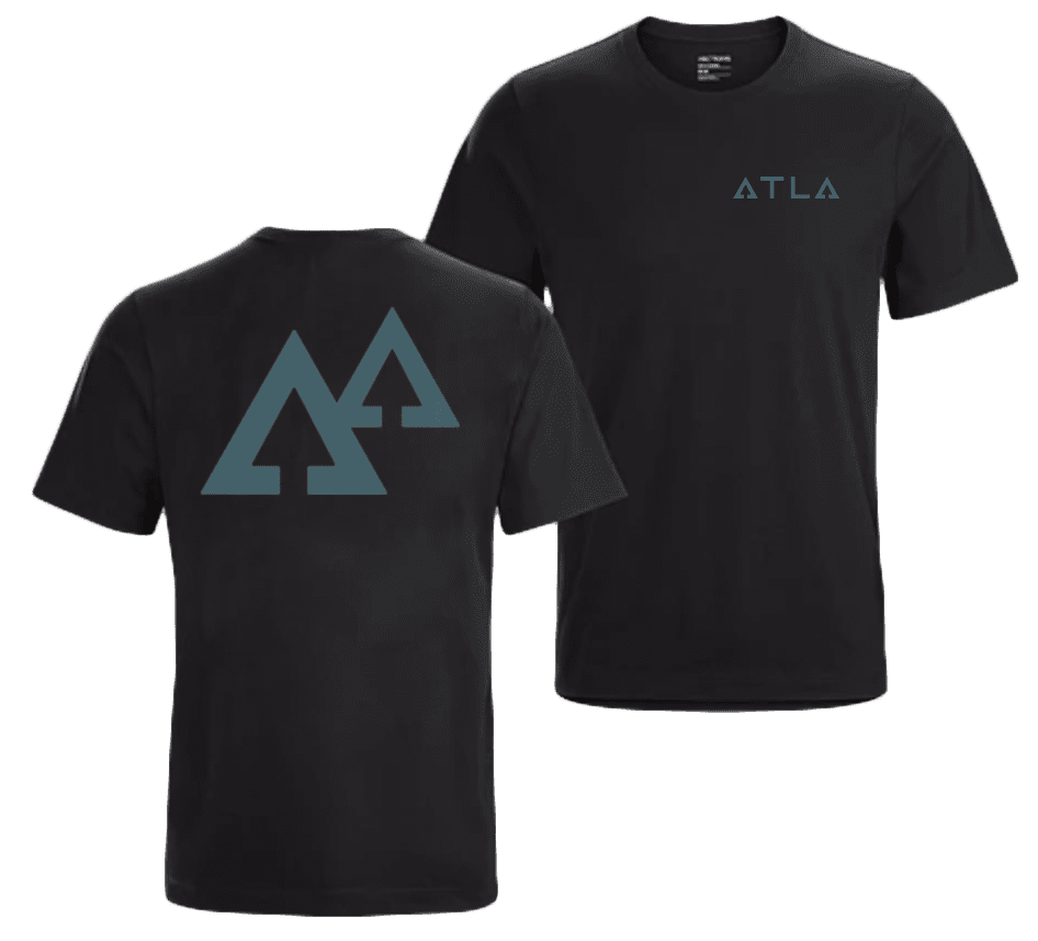
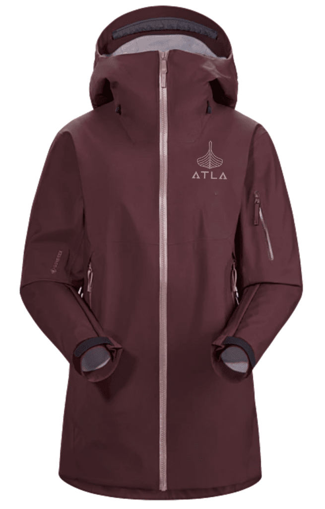
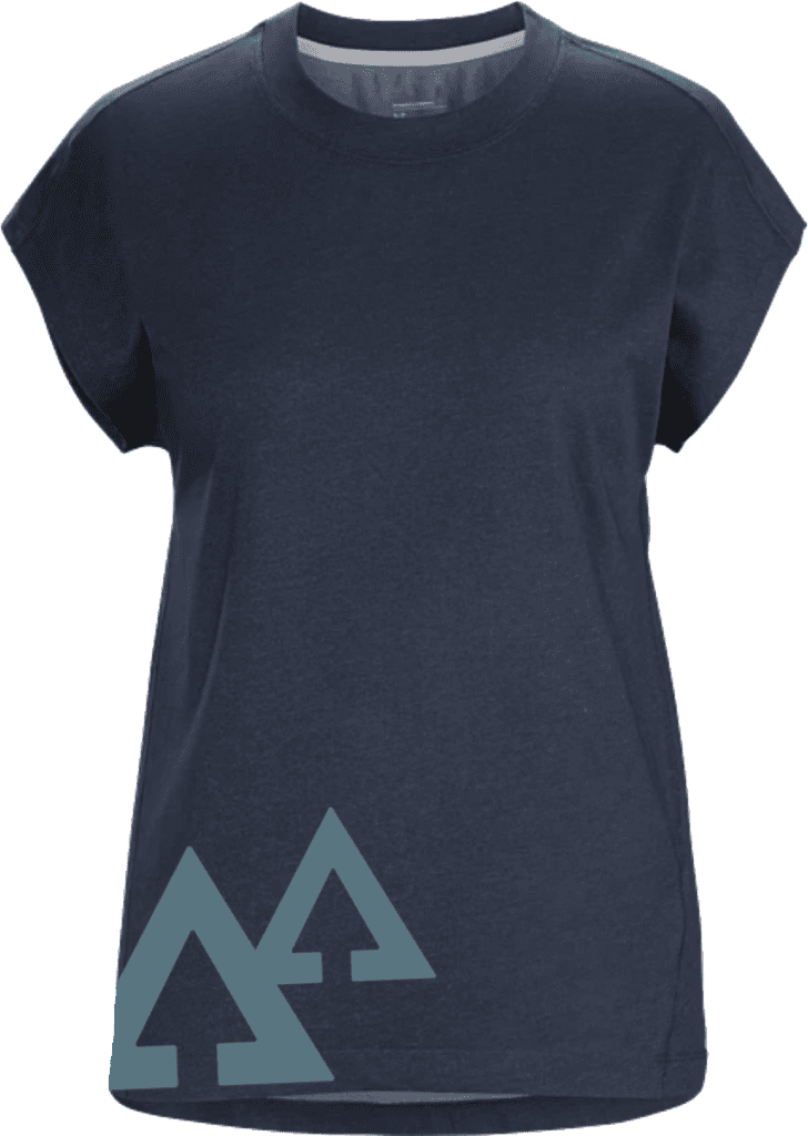
This was a project I did as a student at the Centre for Arts & Technology. I wanted to showcase a high-end outdoor clothing company that uses technical materials. **Available for purchase**

The Client
A Premium Outdoor Brand
The Objective
For the avid outdoors person, ATLA was meant to portray durability, high-performance, and reliability. I imagined this product being sold as a more premium alternative to other brands such as North Face and Columbia which were more mass produced and urban focused.
Target Audience
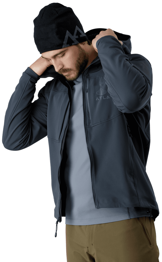
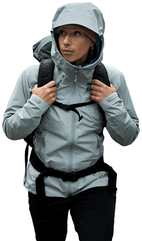
• 18 – 35 Years Olds
• Middle Class; $60k – $90k
• Serious weekend warriors to professional guides
• Outdoor advocates, campfire connoisseurs, or urban explorers
Colour Palette
Typography

The Concept
Atla is the Norse goddess of water.
She is one of the nine wave maidens who lives at the bottom of the sea, watching over the World Mill that continually turns with the seasons to bring the earth and its people fertility and harmony.
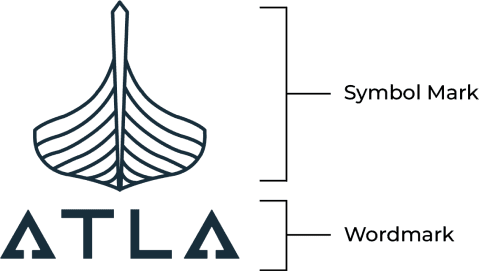
Symbol Mark
- Head-on profile of viking longship honouring heritage
- Abstract resemblance to a leaf, impression of nature
Wordmark
- Bottom slabs of ‘A’ represent Atla living at the bottom of the sea
- Rounded edges to match curves of ship above
- Arrows in ‘A’s to give impression of “ascending”, “reaching for the top”
Outshine the Competition
Logos and branding that will put the spotlight on your business.
