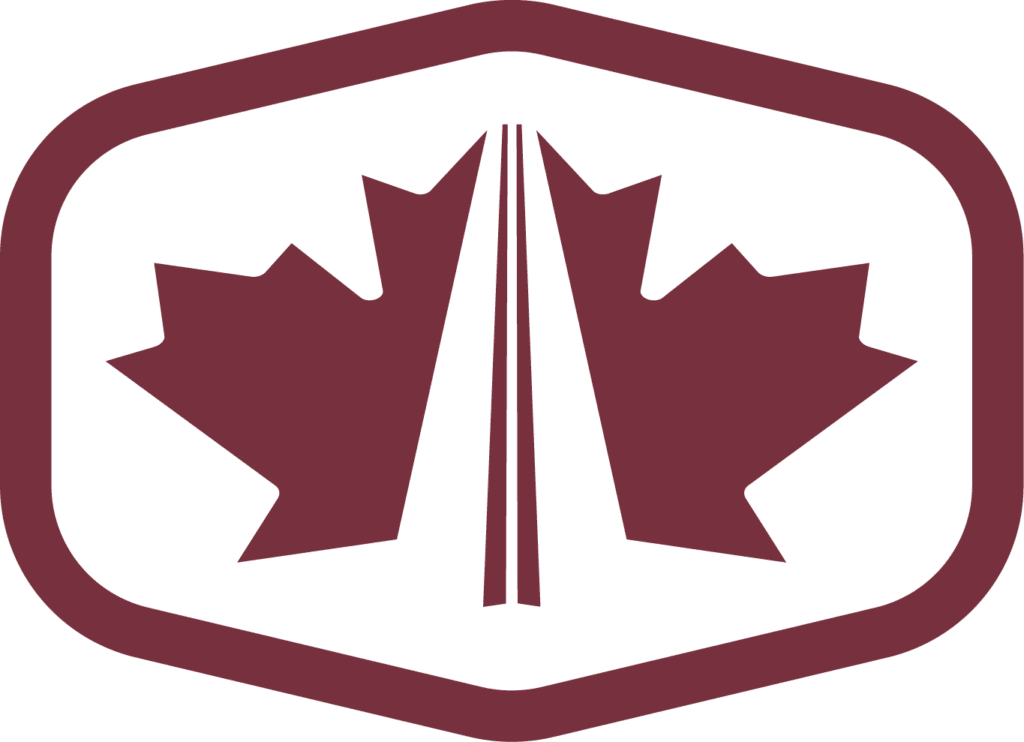

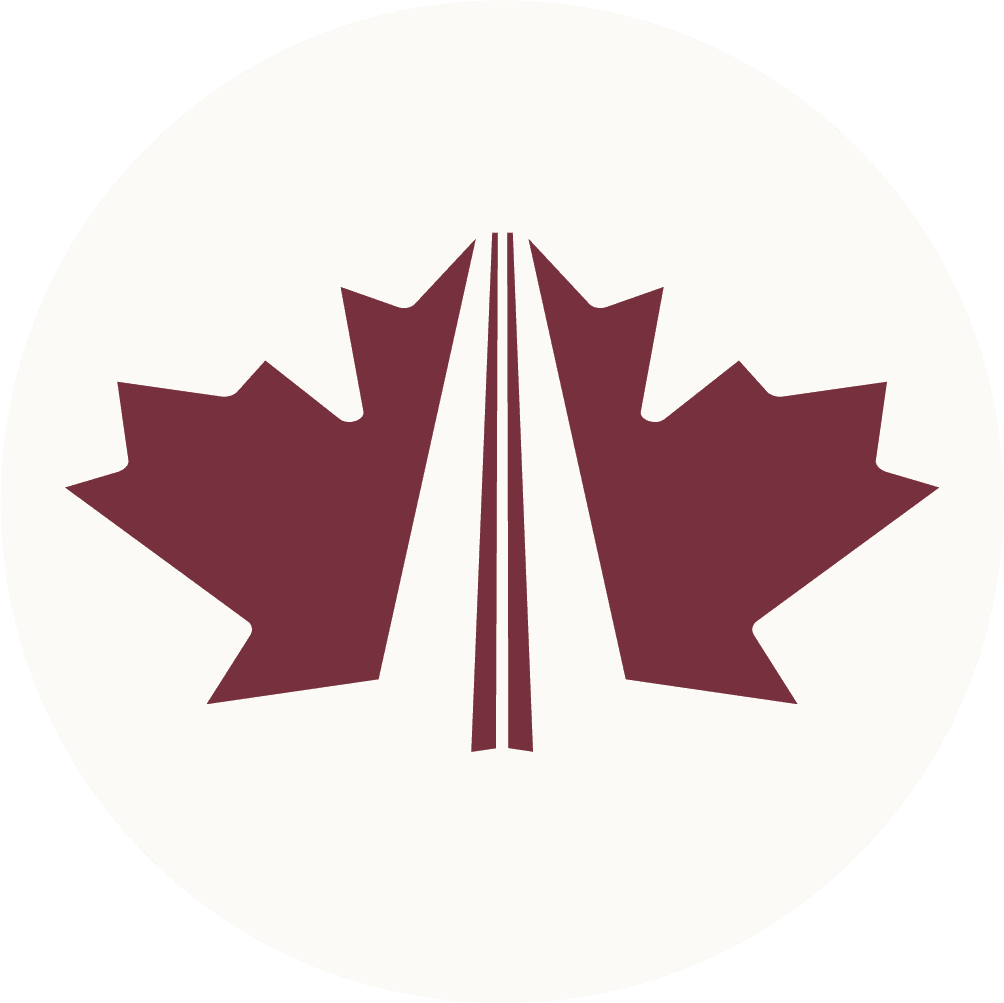
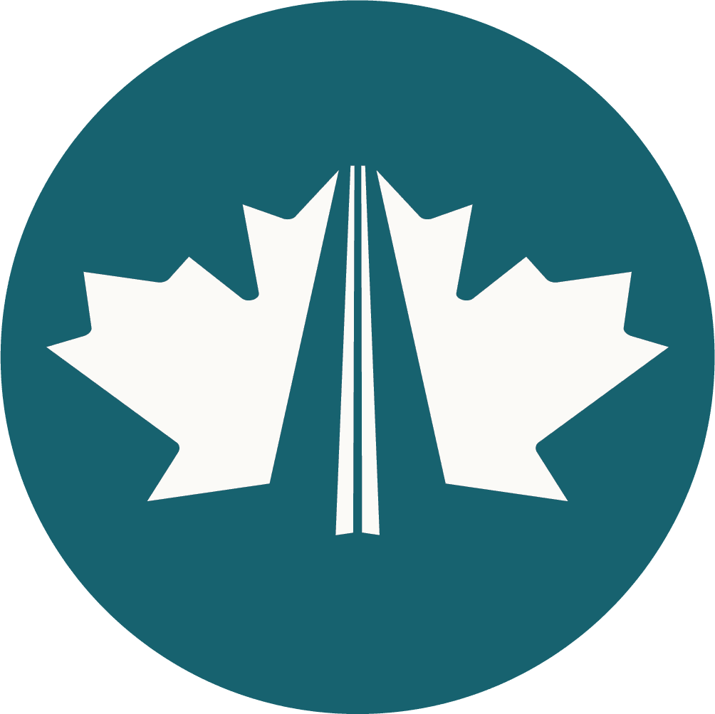
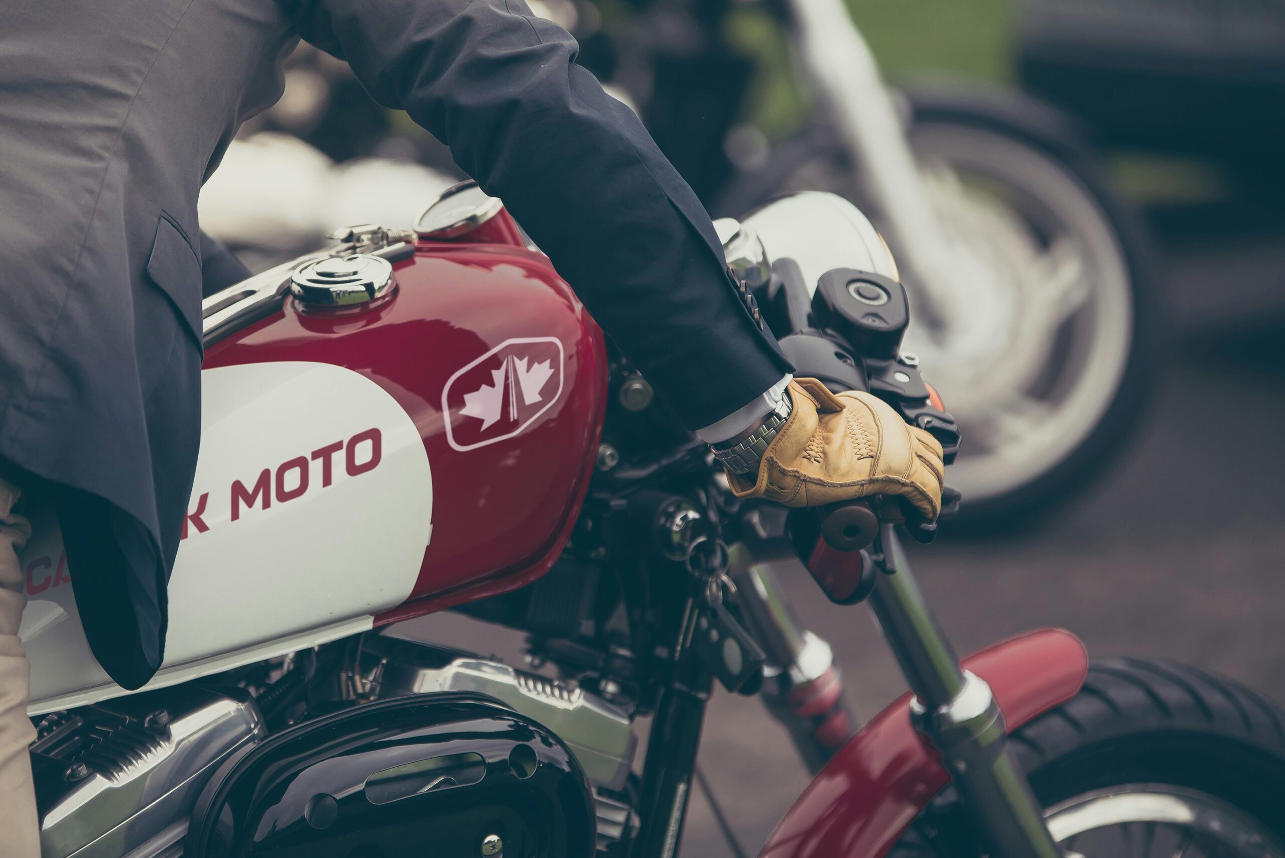
When Canuck Moto Ltd., a premier specialty motorcycle shop based in London, Ontario needed a logo that captured their passion for the open road, I knew it had to be something bold, modern, and timeless.
Canuck Moto Ltd. is all about custom motorcycle builds, repair, and high-quality parts—with a special focus on Harley-Davidson motorcycles. Their deep-rooted commitment to the rider community made it clear that their brand needed to reflect not just their technical expertise, but also the spirit of adventure and camaraderie that fuels every ride.
With owner Phil Blackwell’s background in the Canadian Army (the same trade as I was, a Combat Engineer) and with a name like Canuck Moto, I also wanted to incorporate his patriotism into the brand. The final design blends clean, futuristic elements with a badge symbolizing both the freedom of the road and our country’s iconic maple leaf titled down ever so slightly towards the horizon.
This project was a true passion piece—creating something that not only stands the test of time but also honours the dedication, craftsmanship, and brotherhood of the motorcycle world.