Tawaw is a Cree term meaning “welcome” or “come in, there’s room.” It reflects the cultural values of community and inclusiveness. The company’s mission is to create cleaner, renewable systems of energy for aboriginal communities while providing work opportunities when building these projects. They work in both residential & commercial solar systems, research & development for energy storage (batteries), and provide consulting services.

The Client
Solar Energy for Good
The Objective
Create a brand that reflects their aboriginal ownership and the communities they work with.


Target Audience
Indigenous Communities
Needed to appeal to working-age (18 – 65 year old) community members. Important to incorporate indigenous art styles into symbol mark
Government Agencies
Had to look professional, respectable, and legitimate in order to access government programs
The Environmentally Conscious
Properly communicate the sustainable nature of these systems through colour and symbology.
Keywords
- Community
- Sustainability
- Accountability
- Innovation
- Indigenous Heritage
Colour Palette
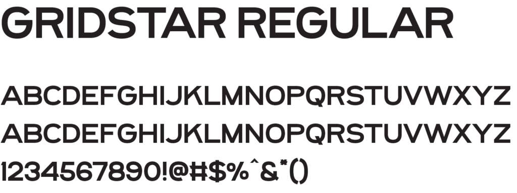
Typography
The Concept
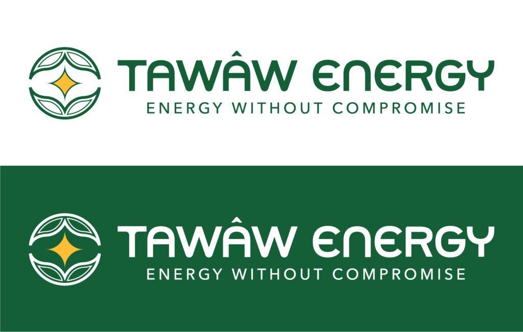
Outside of Symbol Mark
- Leaf / Plant like shape to represent nature & sustainability
- Inner tracings typical of indigenous artwork
- Surrounding, nurturing outer shell to indicate community spirit
Center of Symbol Mark
- Bright star-shape as an expression of (solar) energy
Ready for the
Glow Up?
Logos and branding that will put the spotlight on your business.
